

Brand identity and digital experience for Mega Compu World — a new MCW identity, carried into a website built for enterprise technology.
01 · Identity
Logo design by Ruckus
02 · Website
The Project
A new identity — and the digital experience built around it
Mega Compu World started over 25 years ago as an IT distribution company in Bengaluru. Today it delivers IT solutions and services across India — from end-user computing and data centres to networking, cyber security, cloud, structured cabling and software licensing.
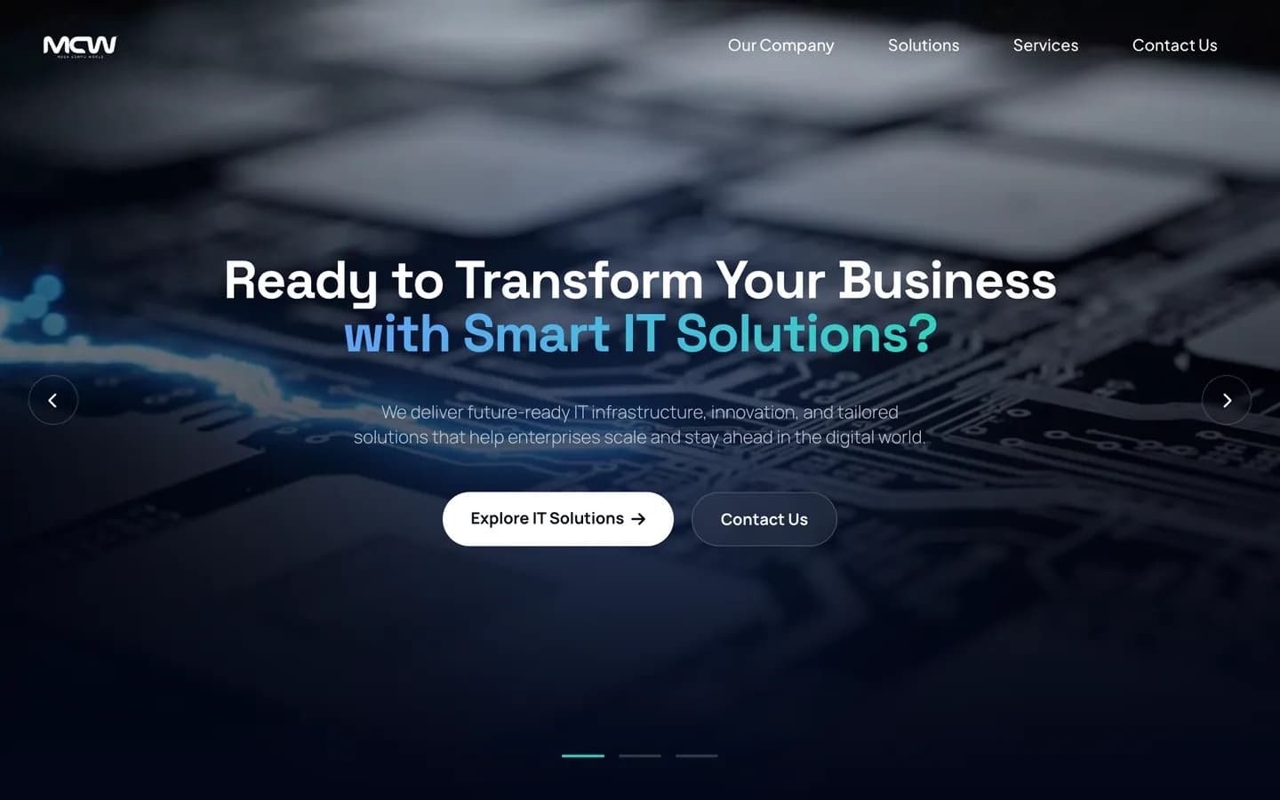
Ruckus created its new identity — the MCW logo — and then designed and developed megacompu.co.in around it: one confident visual system, carried from the mark into every page of the website.
Services
- Logo design
- Brand identity
- Website design
- UI design
- Website development
Sector
- IT infrastructure
- Enterprise technology
Platform
- WordPress
- Elementor
- Tailwind CSS
Client Mega Compu World
The challenge
IT infrastructure is a technical, enterprise-driven category — and most of it looks the same. Mega Compu needed a brand that signals all of this at once, without becoming another generic blue tech logo.
- 01Trust
- 02Technical expertise
- 03Scale
- 04Reliability
- 05Modernity
- 06Future-readiness
Chapter 01 · The identity
Primary · on light
#2854B5
Reversed · on dark
White
Logo system
- Monogram
- MCW — bold, rounded letterforms, set large.
- Descriptor
- MEGA COMPU WORLD, in widely spaced capitals beneath.
- Versions
- Blue for light backgrounds, white for dark.

Applications
One mark, from the office wall to the browser tab
The same logo, used exactly as drawn — in the physical space, and on every screen of the website.
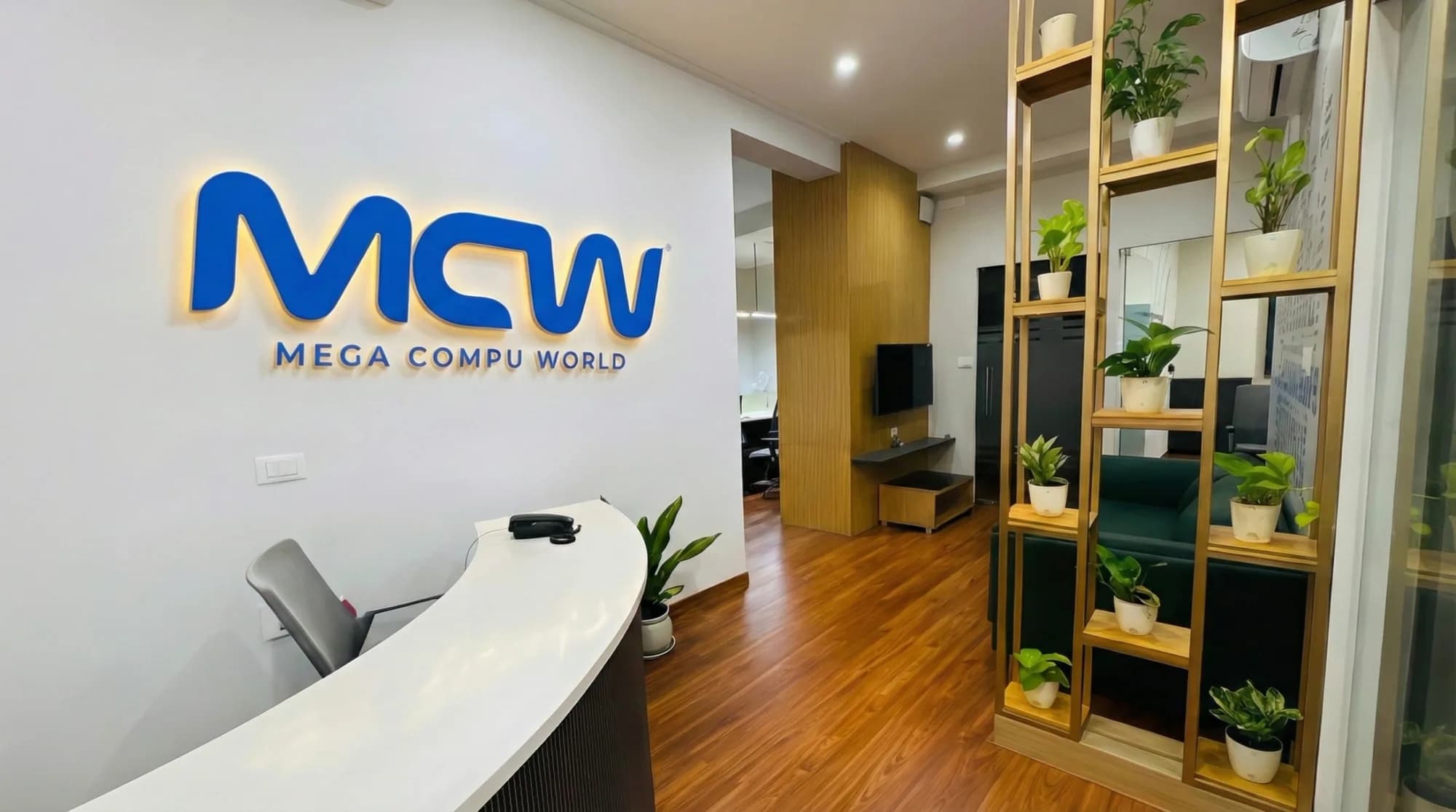
Office signage · photographed for the website’s heritage section


Website header and footer

Mobile header
 megacompu.co.in
Site icon
Chapter 02 · Brand → digital
The identity set the tone; the website carried it — from colour and type to the way every card, panel and button behaves.
- 01
Identity
The MCW mark, white on deep navy
- 02
Colour
Logo blue, then the site’s navy, blue, mint and violet
- 03
Typography
Space Grotesk across headlines and interface
- 04
Graphic language
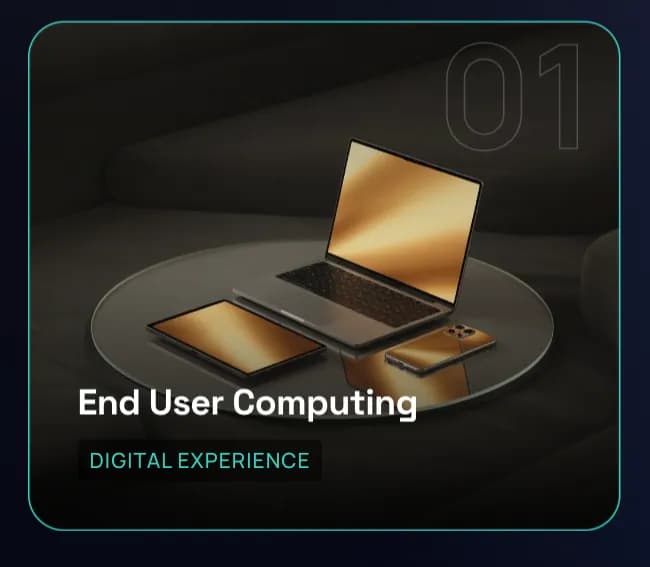
Numbered cards and dark, glossy product renders
- 05
UI
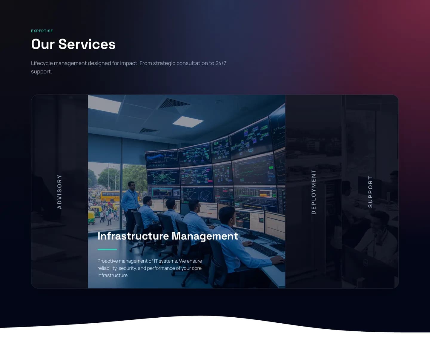
An accordion that opens one service at a time
- 06
Website
megacompu.co.in
Colour — logo, then the website’s own tokens
- Logo blue#2854B5
- brandDark#020617
- darkbg#0F172A
- vivid#3B82F6
- mint#2DD4BF
- blurple#4C1D95
Chapter 03 · The website
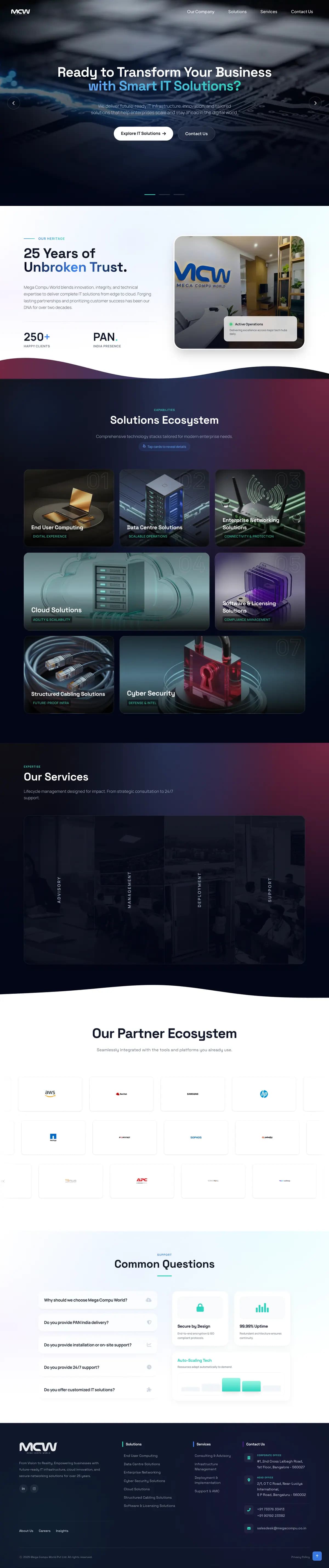
Positioning, heritage, solutions, services, partners and answers — in the order an enterprise buyer needs them.
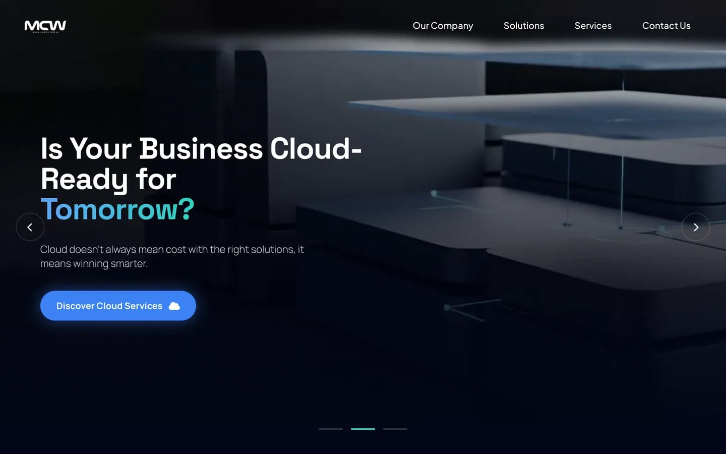
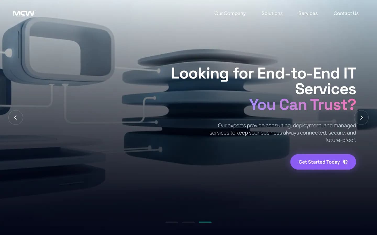
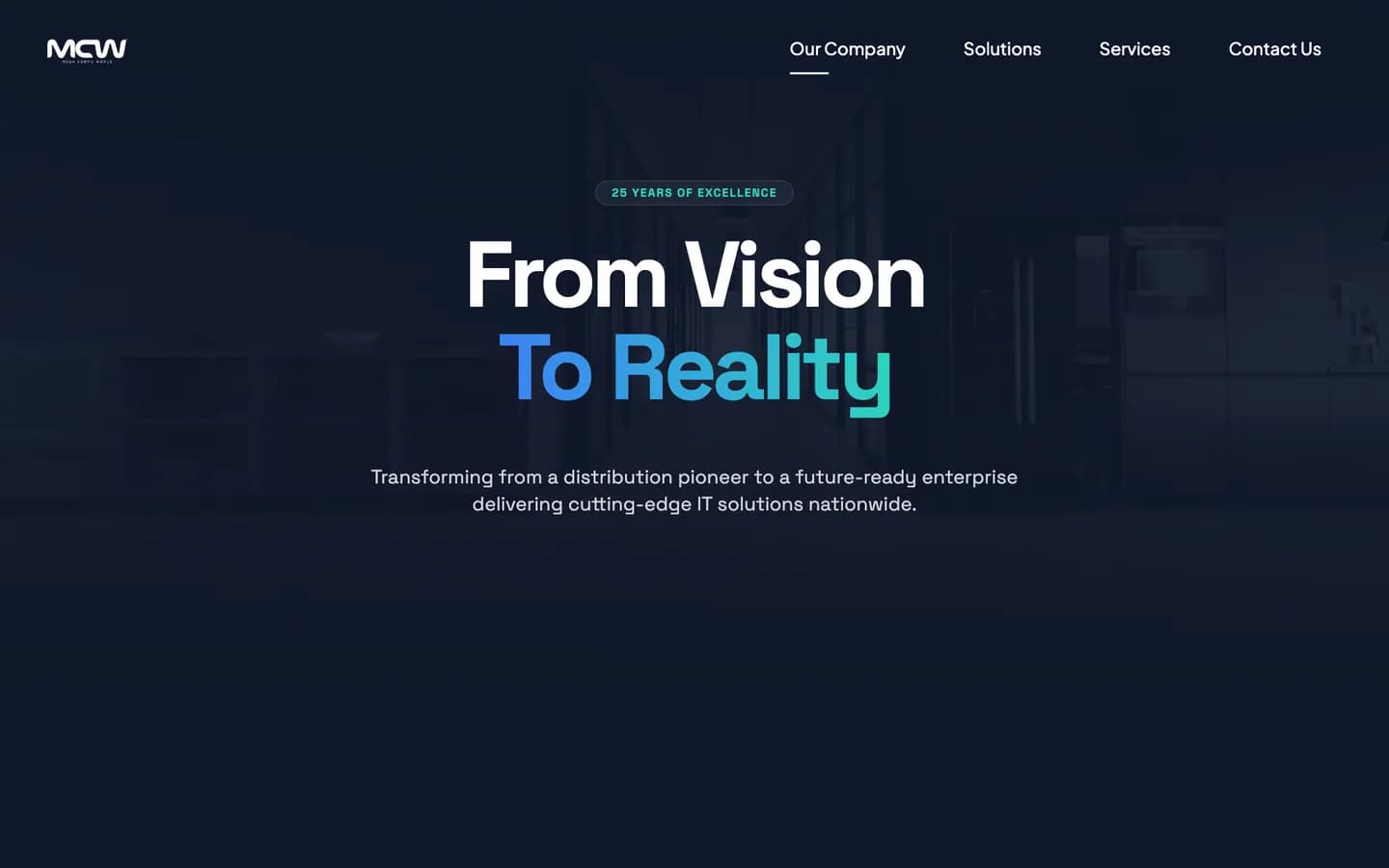
Hero · three messages, one slider
- 01
Heritage
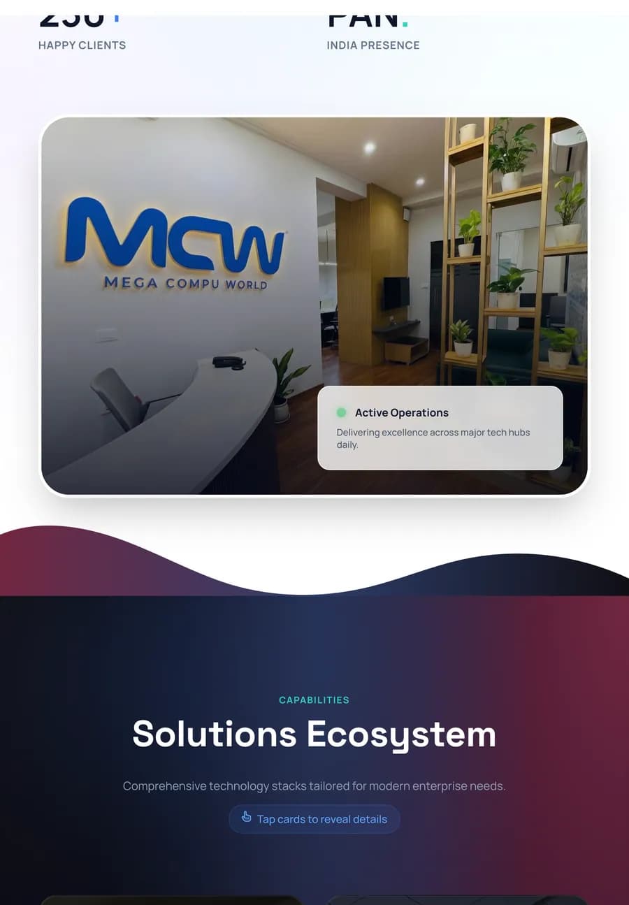
Who Mega Compu is — 25 years, 250+ clients, PAN-India — beside the MCW sign in its own office.

- 02
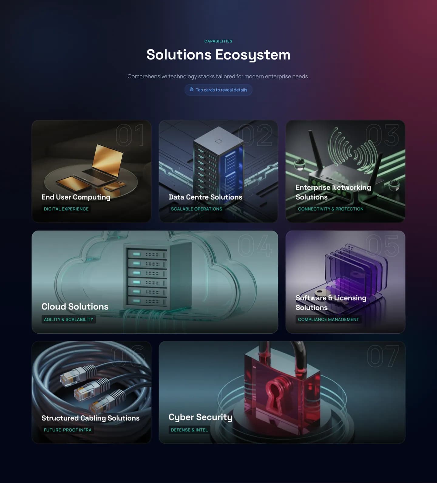
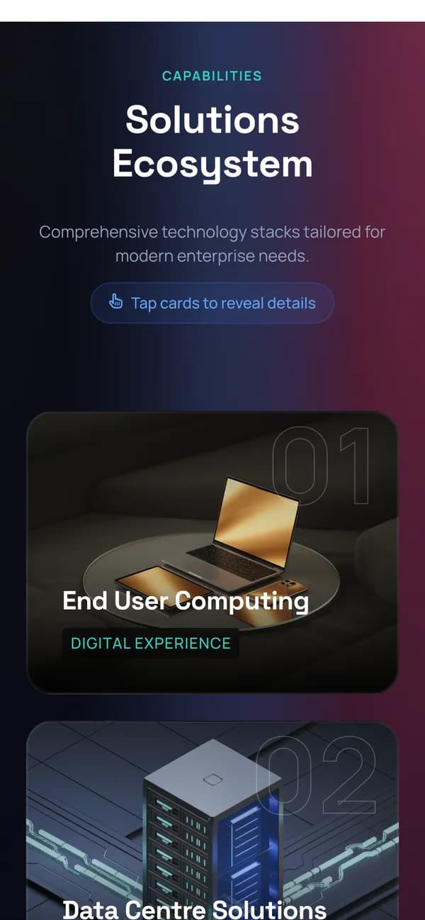
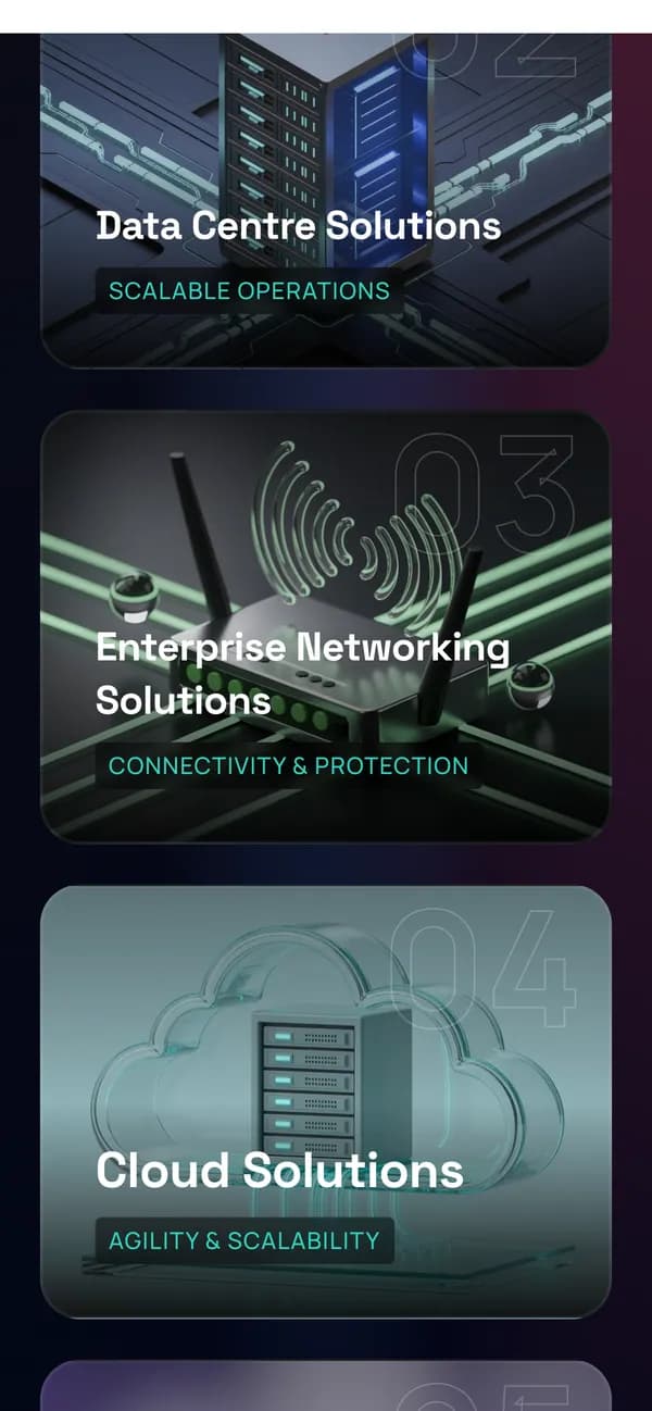
Solutions ecosystem
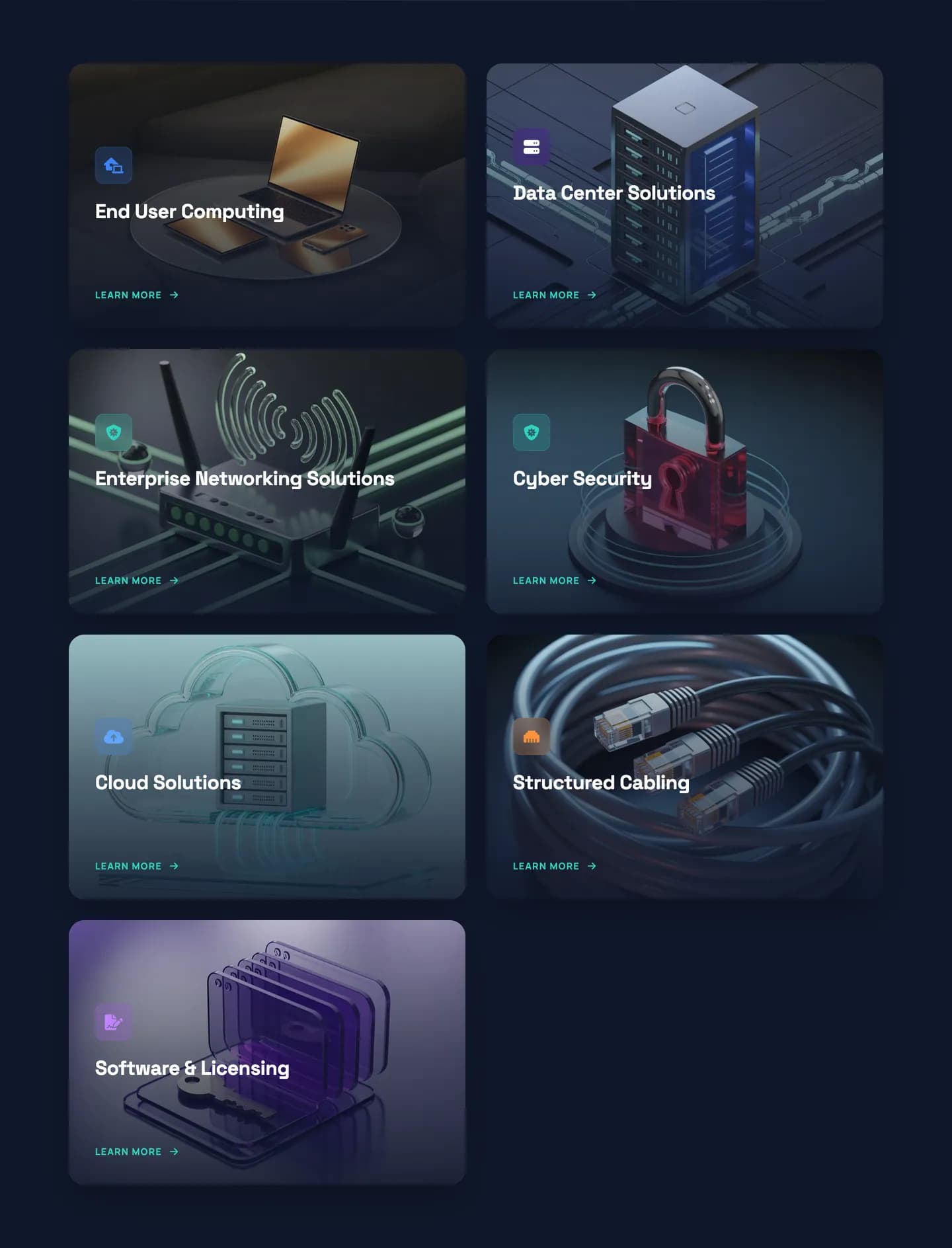
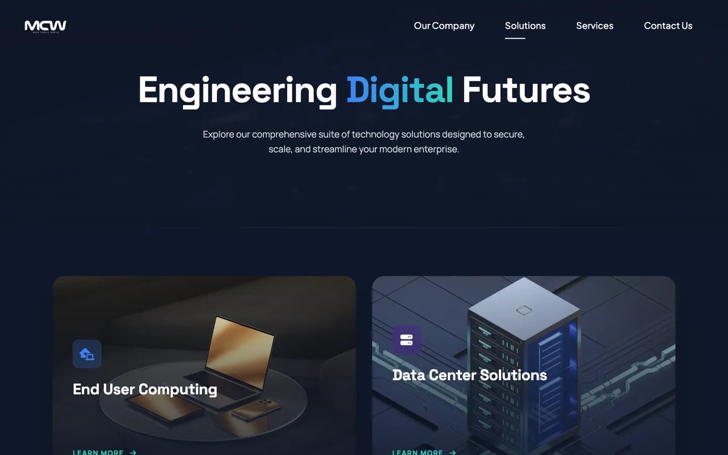
Seven solution areas as numbered, image-led cards: one glance shows the whole offer.
- 03
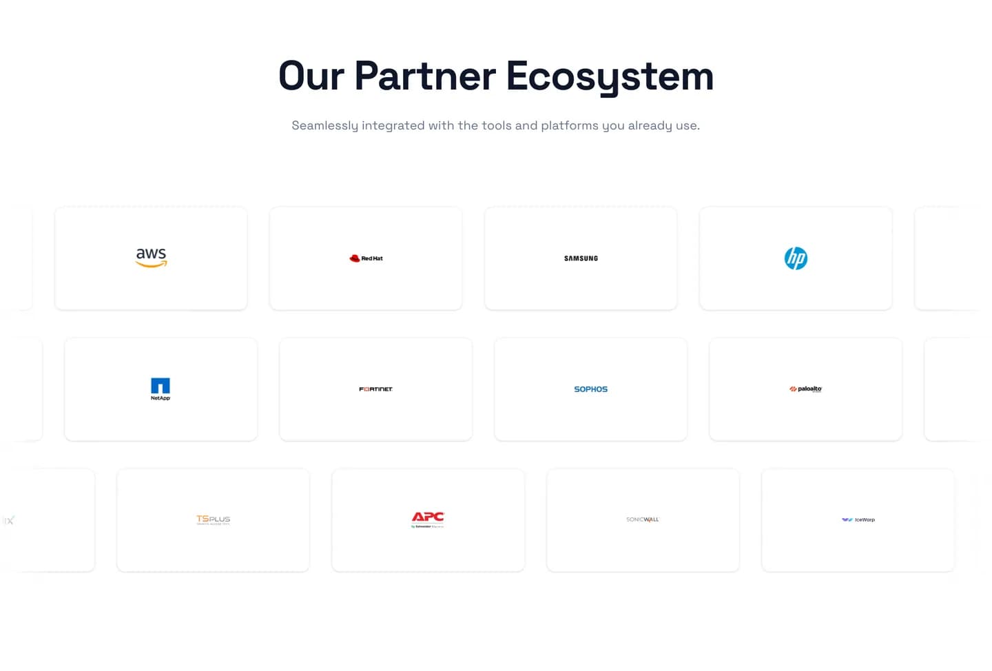
Partner ecosystem
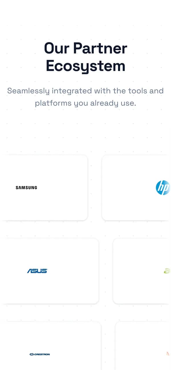
The technology brands Mega Compu works with, in one calm grid.
- 04
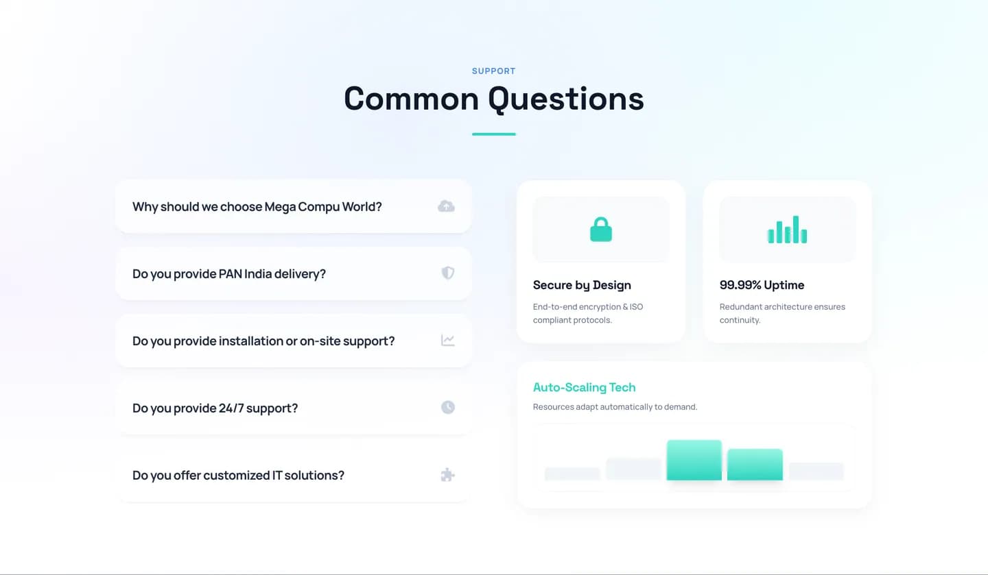
Common questions
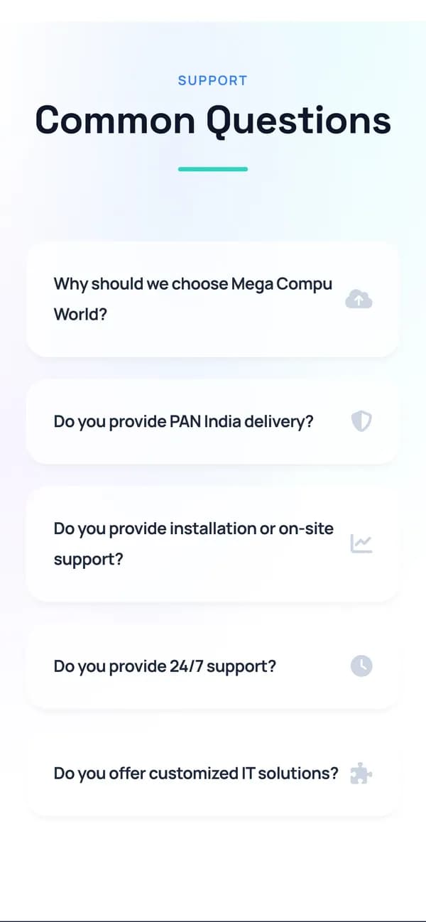
The questions enterprise buyers ask — delivery, support, installation — answered before they call.
- 05
Footer
Every solution and service, both offices, phone and email.
Information architecture
A broad technology offer, folded into a navigation anyone can read in a second: who we are, what we provide, how we work with you, and how to reach us.
Our Company
3- About Us
- Careers
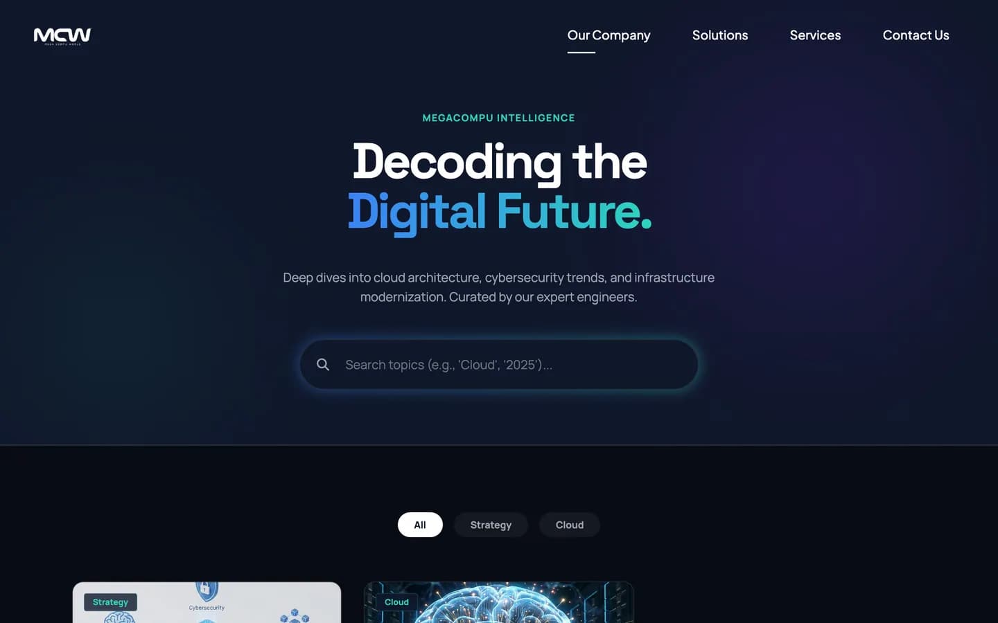
- Insights
Solutions
7- End User Computing
- Data Center
- Enterprise Networking
- Cyber Security
- Cloud
- Structured Cabling
- Software & Licensing
Services
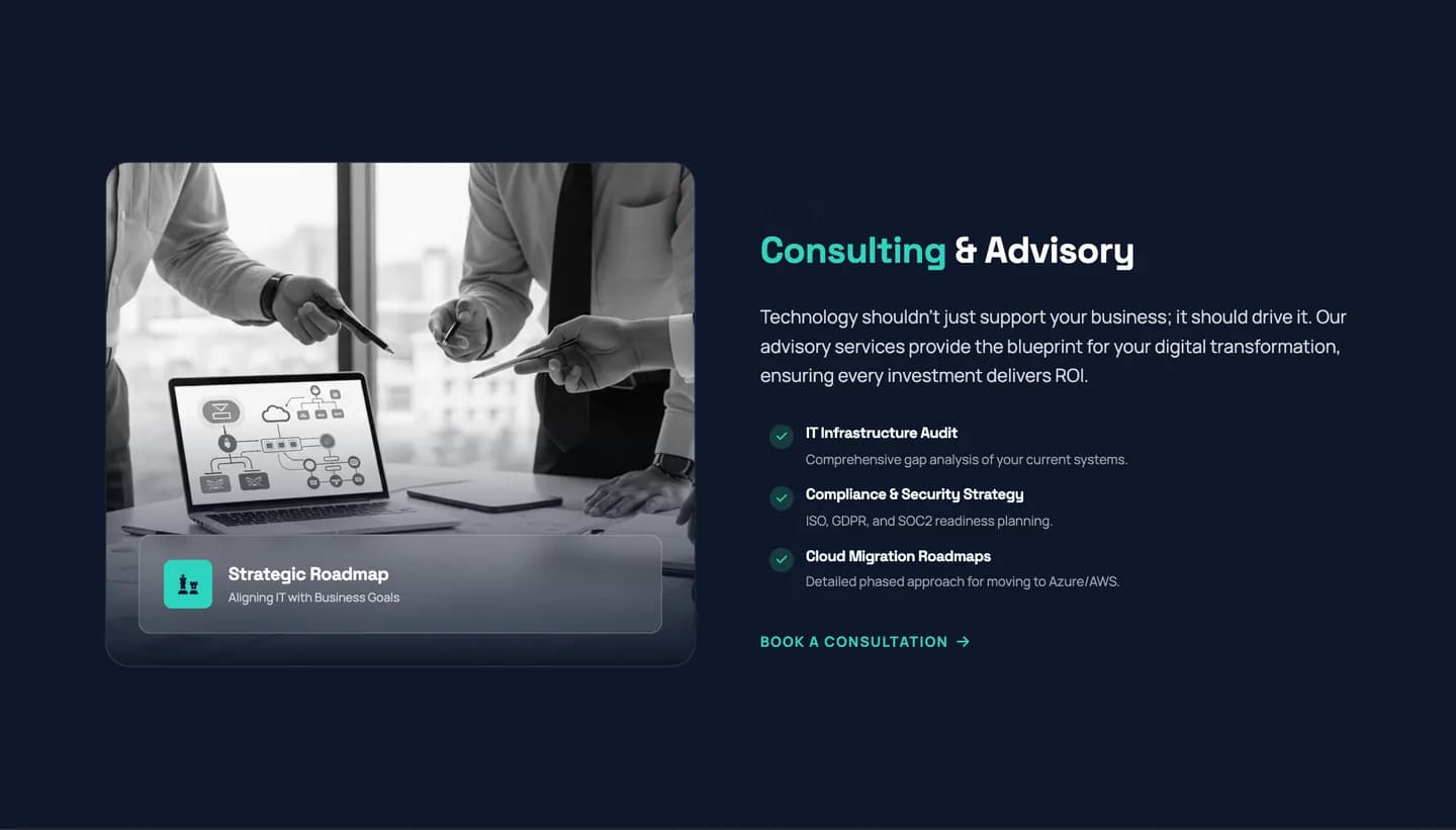
4- Consulting & Advisory
- Infrastructure Management
- Deployment & Implementation
- Support & AMC
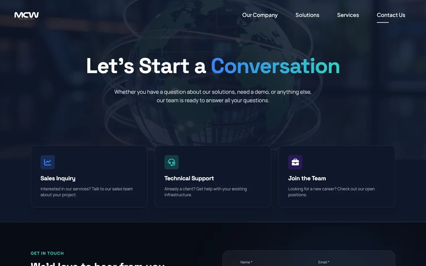
Contact Us
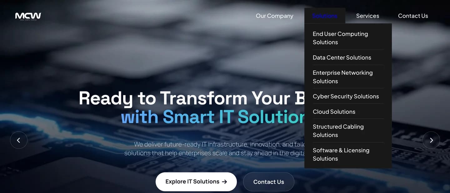
Solutions menu — seven pages
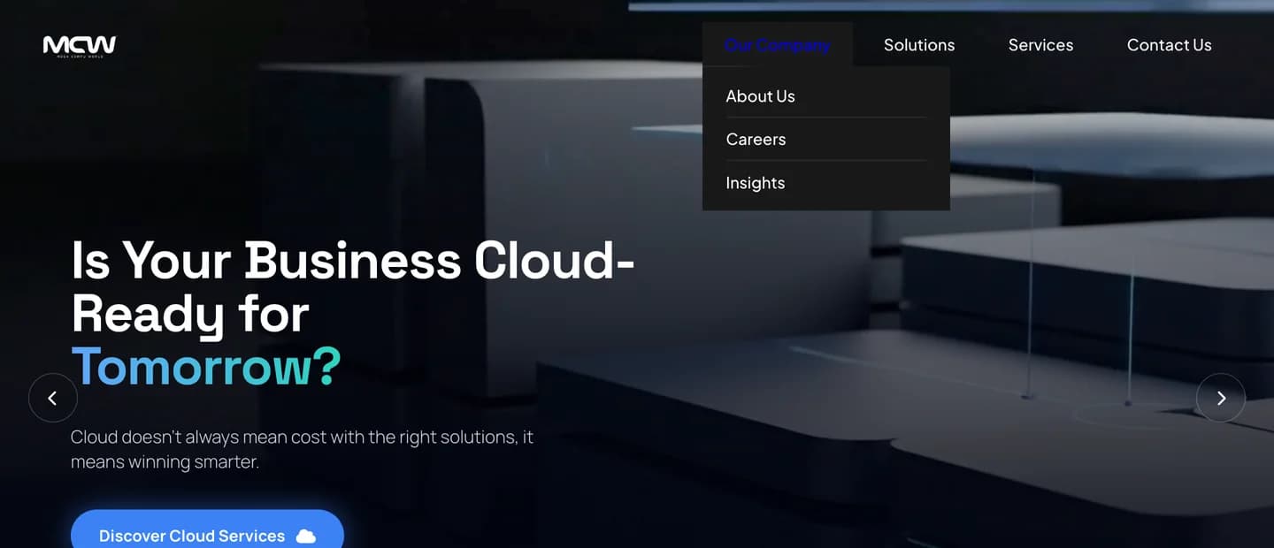
Our Company menu
Solutions ecosystem
Seven solutions. Seven pages, each with its own voice.
Every solution area gets a page that opens on one strong line and its own art direction — inside the same system of type, colour and components.
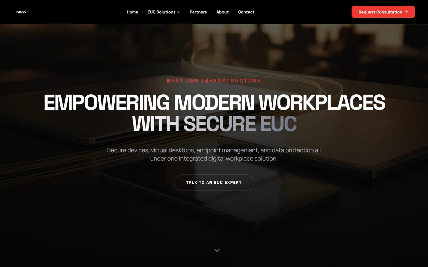
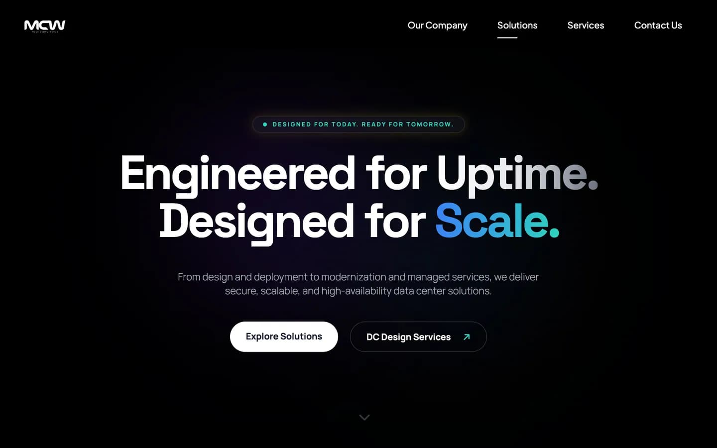


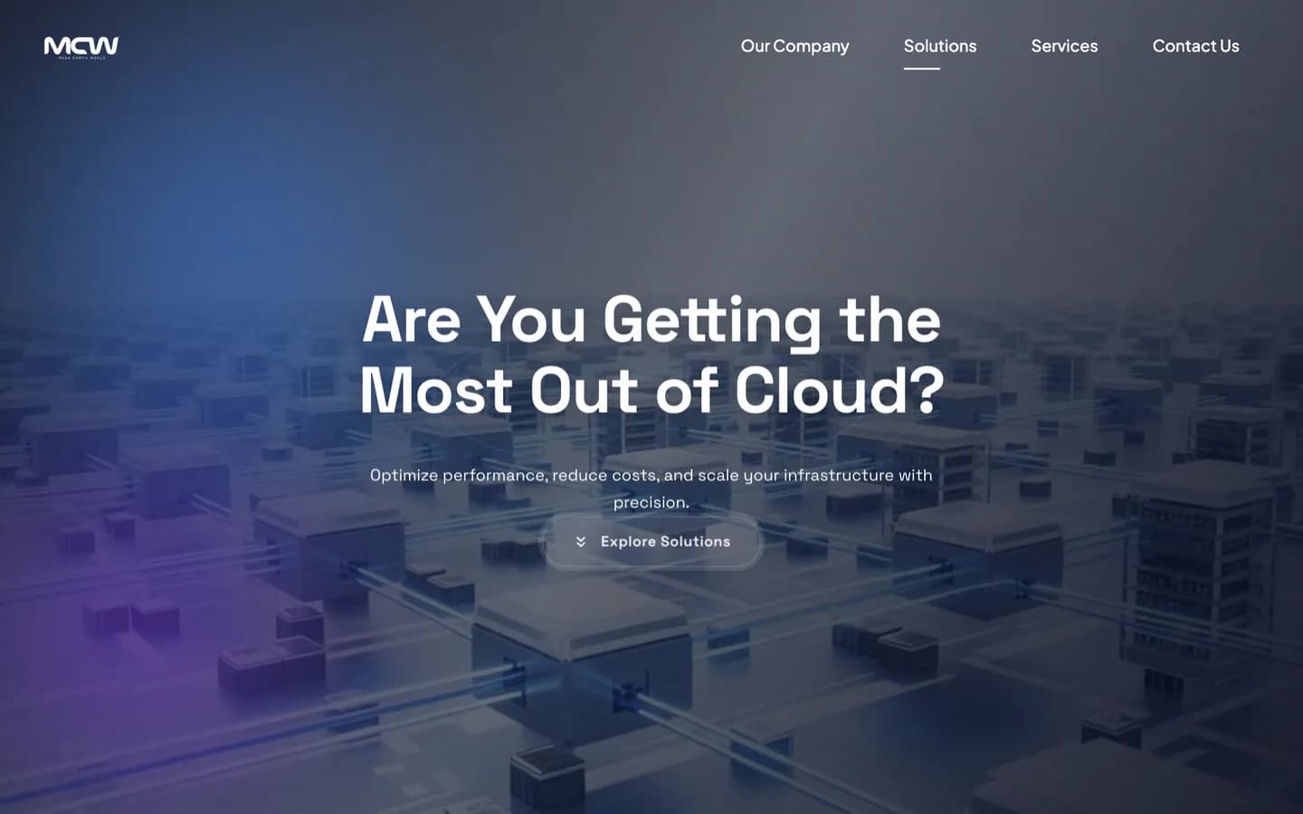

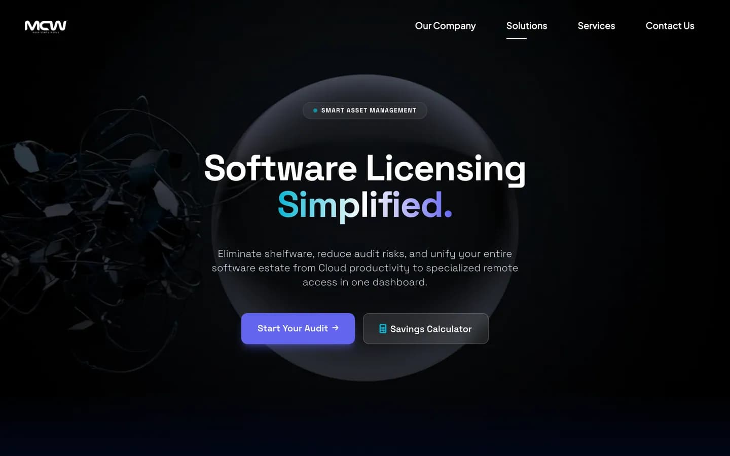
Homepage · the whole offer, at a glance

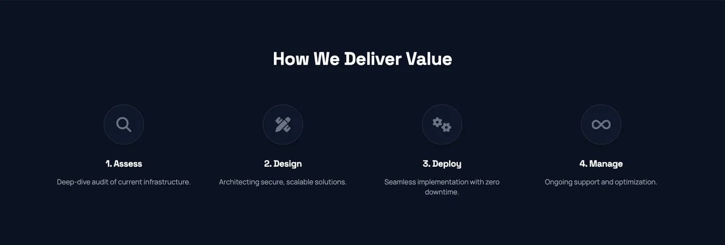
A numbered card · the Solutions page’s four-step process
Services
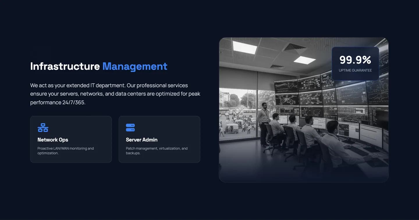
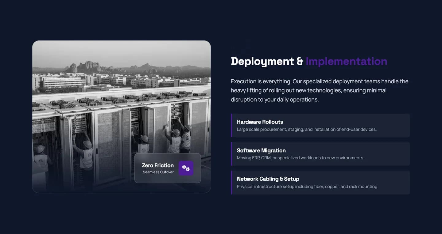
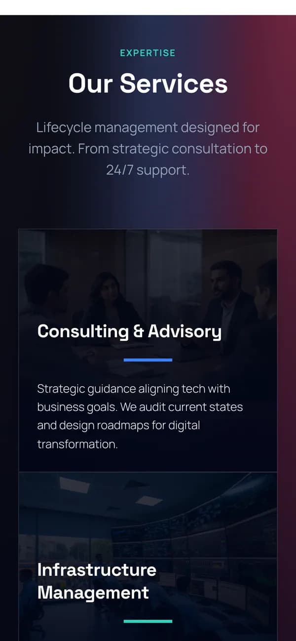
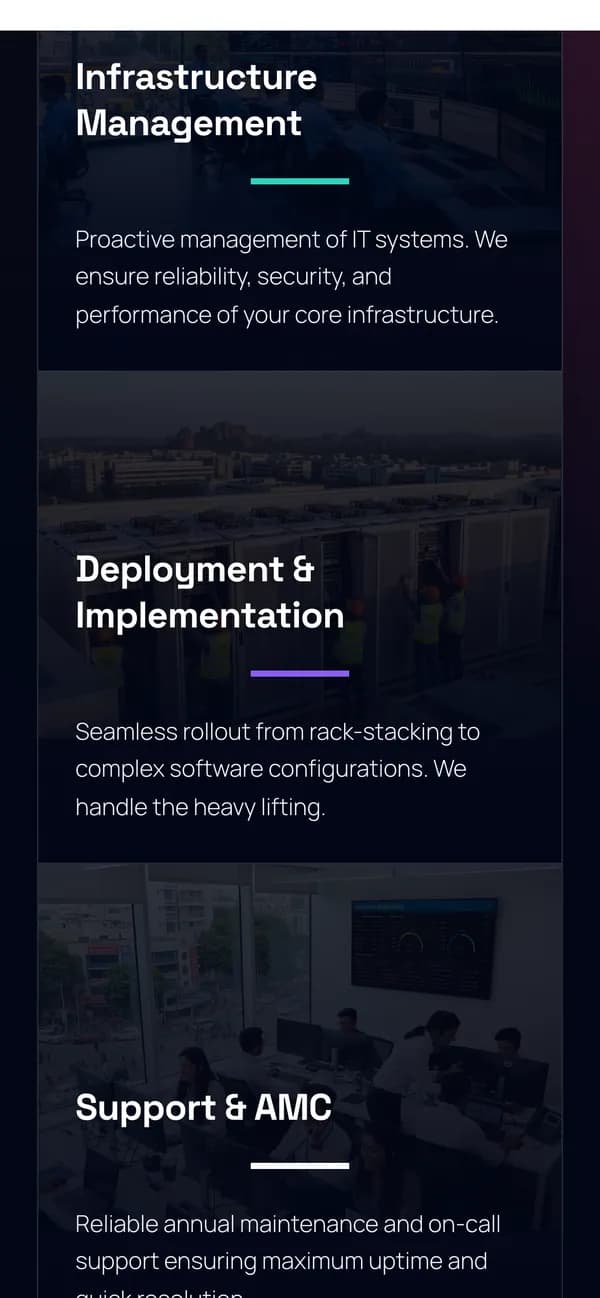
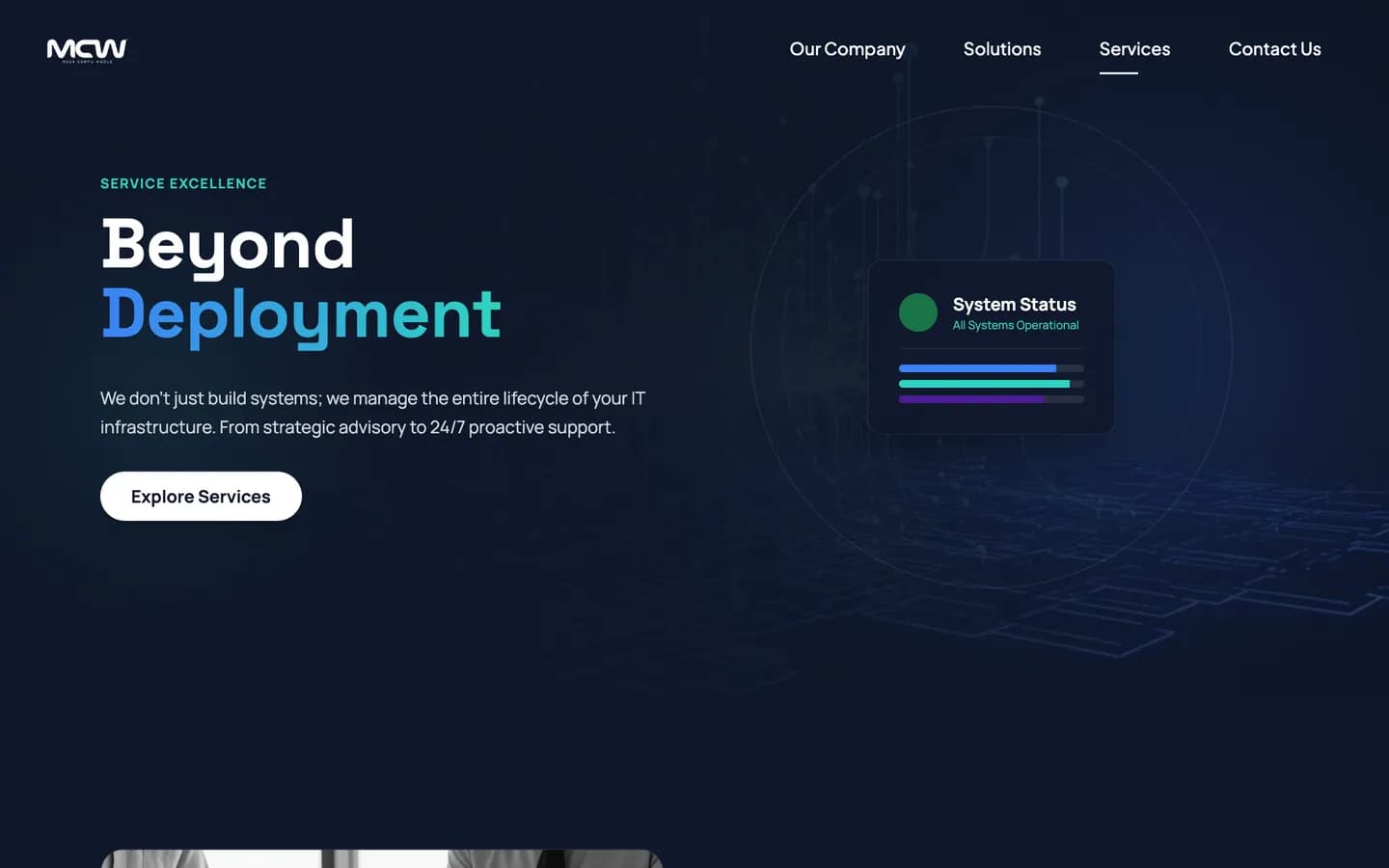
On the homepage the lifecycle is one accordion: four panels, one opens at a time. The Services page then gives each stage its own chapter.
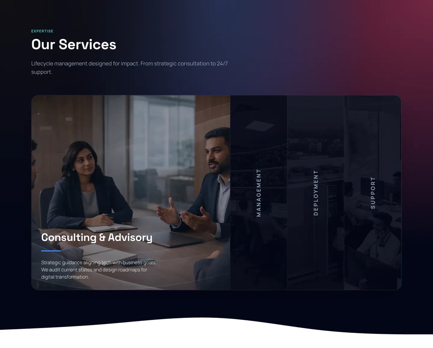 01Consulting & AdvisoryAdvisory
- 02Infrastructure ManagementManagement
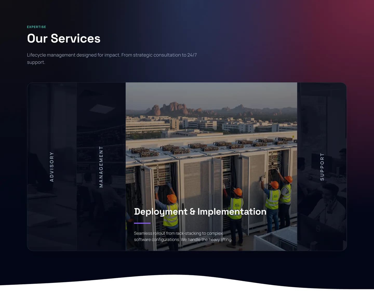 03Deployment & ImplementationDeployment
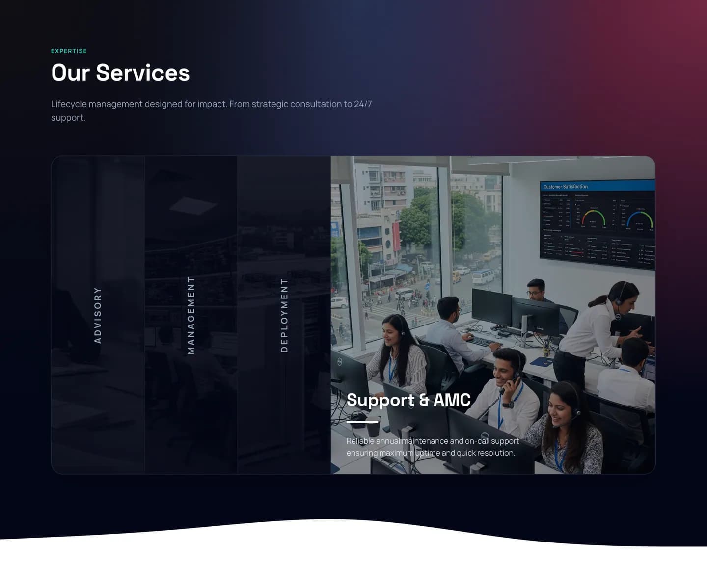 04Support & AMCSupport
The Services page · one chapter per stage

Heritage
25 years
of trust.
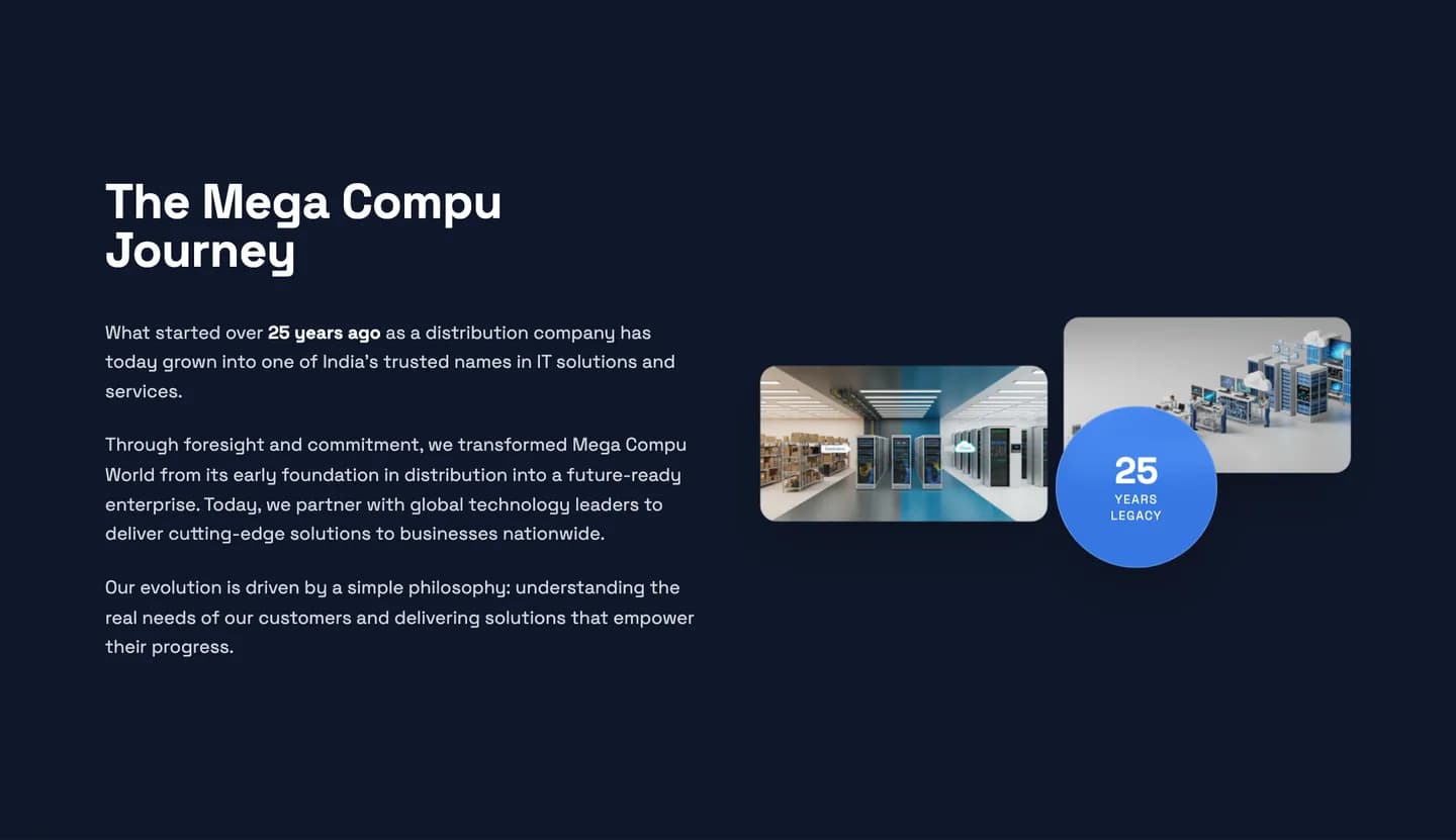
Mega Compu’s story — from distribution pioneer to IT solutions company — is part of what the brand had to carry. The website puts it up front, on the homepage and in a dedicated About page.
- years of heritage
- 25years of heritage
- happy clients
- 250+happy clients
- India presence
- PANIndia presence
Mega Compu World’s own credentials, as published on megacompu.co.in.
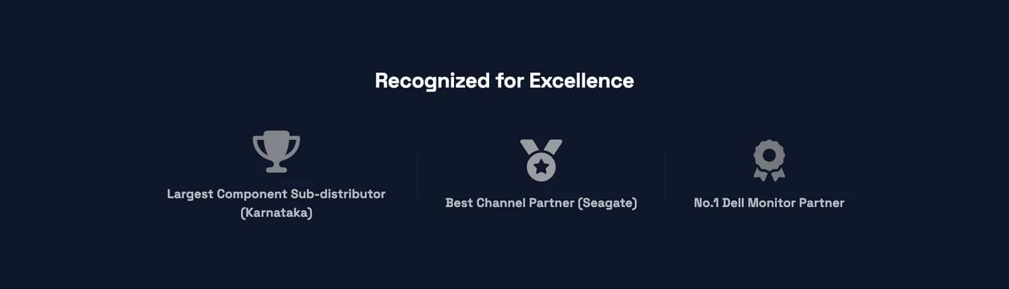
Recognised for excellence
- Largest Component Sub-distributor (Karnataka)
- Best Channel Partner (Seagate)
- No.1 Dell Monitor Partner
As listed on the About page.
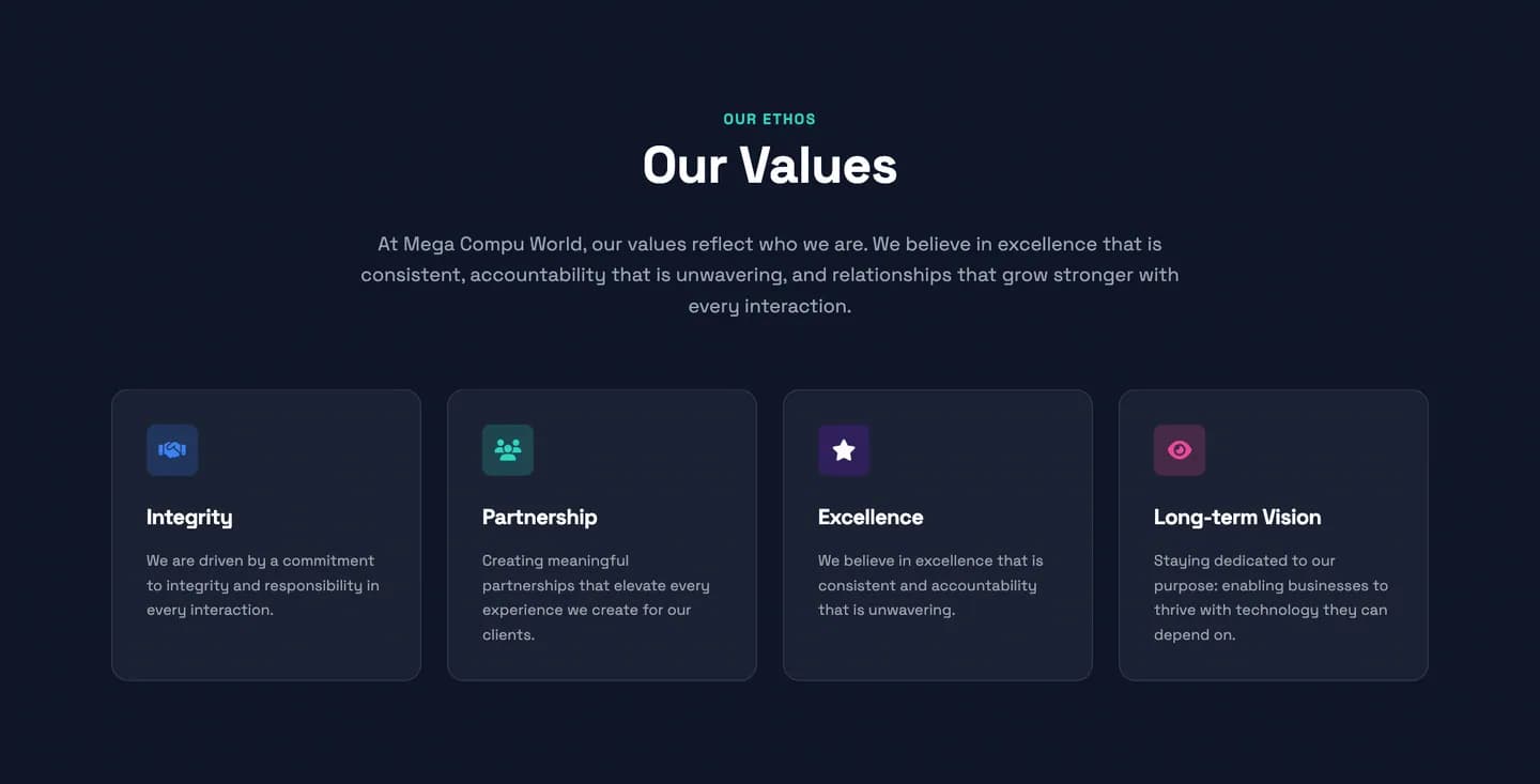
UI details
The details make the system
Navigation

Buttons
Solution card
Service panel
Value cards
FAQ accordion

Call to action
Recognition row
Responsive
The same system, on every screen
On a phone the menu folds into a single button, cards stack into one readable column and the logo leads every screen.


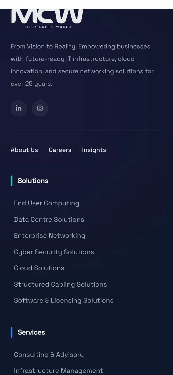
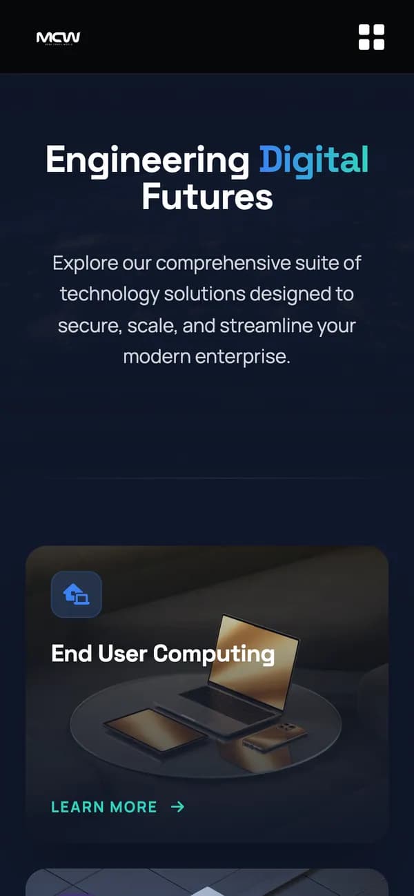
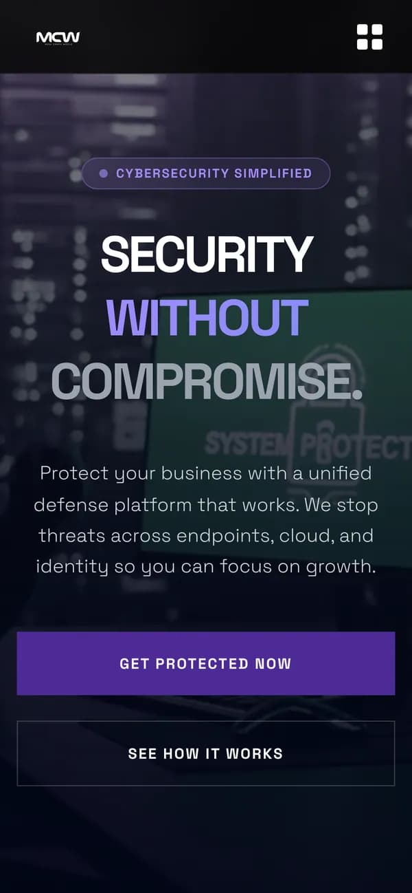
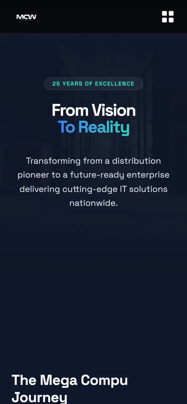
Brand + digital system
- 01Logo
- 02Brand language
- 03Typography
- 04Colour
- 05UI components
- 06Website
- 07Digital experience
The website in full
Page by page

One identity.
One digital experience.
Built for what’s next.
Brand identity and website design & development for Mega Compu World by Ruckus.
